From “Learning Heroes” to Litmos: A Designer’s Perspective on the Brand Evolution of Litmos

In this blog post, I will take you on a creative journey that explores the brand evolution of Litmos, from its early days as “Learning Heroes” to what we now call Litmos!
I’ve been lucky enough to work at Litmos for over five years now as a Senior Graphic Designer. And during that time, I’ve witnessed the development of many visual languages, including the designs for our earliest iteration, when our company was called “Learning Heroes.” Founded in 2014 by Adam Kara, Aaron Kara, Ian Darlington and Mike McGann, “Learning Heroes” transformed a few times over the years – from “Litmos Heroes” to “SAP Litmos,” to its final and current form: Litmos.
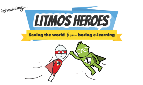
When I started, the illustrational style for “Learning Heroes” was superhero themed, and the tagline read “Saving the world from boring e-learning.”
![]()
Although I was fond of the use of colours and appreciated the playful theme of the design, I always felt there could be improvements to the logo, as well as the mascot, Stickman.
While our branding has come a long way, I feel this original design holds a special place in Litmos history and represents the momentous first steps our organization took towards establishing its unique visual language and company culture. In my mind, the “Learning Heroes” logo is an important reminder to all the original employees, of the humble beginnings of this small, grassroots start-up.
The Litmos team should take a look at these old brand assets from time to time to generate that nostalgic sense of excitement and optimism “Learning Heroes” employees felt in the early days, when the brand was taking shape and finding its identity.
From “Learning Heroes” to “Litmos Heroes” – Lenny’s Debut
By the time I was hired in 2017, “Learning Heroes” was operating under the name “Litmos Heroes” after being acquired by Californian company Callidus Cloud. As a Graphic Designer, new to the company, I tried to understand the brand as much as possible. I immersed myself in the company’s style, values, and goals.
The design of the new “Litmos Heroes” logo hadn’t changed much from the original “Learning Heroes” one. Fonts and colours remained consistent, but the company had added a new “Litmos Heroes” mascot, Lenny (pictured below, wearing a now-uncharacteristic green cape).
With “Litmos Heroes” still being a young business, there was not much in the way of brand guidelines. Being a stickler for processes and organisation – a blessing and a curse! – I created templates and documents to maintain brand alignment.
I used Adobe InDesign for all our course supporting documents, and Adobe Illustrator for thumbnails, designing our ‘corner flags’ to differentiate courses by region, as well as ‘roundel flags’ to identify course language(s). I distributed these designs to teams across the organization, to ensure that all “Litmos Heroes” internal and external materials were consistent with brand guidelines.
“SAP Litmos” is Born – Goodbye, Stickman!
In 2018, Litmos Heroes was acquired by tech giant SAP. This is when “SAP Litmos” was born.
I must admit, at this time I was feeling a mix of emotions about our beloved brand. On one hand, there was a tinge of sadness as I bid farewell to the familiar “Litmos Heroes” Stickman mascot. However, amidst the sadness, there was an undeniable sense of excitement brewing. Change opens the door to new possibilities, and I was eager to see how the brand would evolve and reinvent itself.
Once again, I threw myself into new branding exercises. Having established the brand guidelines for our last rebranding, I felt more prepared to develop visuals for this new phase of the company’s evolution. Removing old branding from all supporting documents proved to be a mammoth task, but I was grateful for the help of my colleagues.
Gone was the superhero styling of the Litmos Heroes logo, as well as the mascots Stickman and Lenny (as we knew him).
![]()
The new logo for “SAP Litmos,” was more of a minimalist design, featuring a Sans Serif font to give a timeless feel. The colour palette was a classic combination of black and gold, with an alternate blue and gold option.
The Lenny mascot also had a makeover and was a lot more sophisticated, which worked well to balance out the logo.
By 2020, we had rebranded and were now known as “SAP Litmos Training Content,” but the logo was very much the same, except for the addition of more vibrant colour palettes.
A New Era Begins: “SAP Litmos” Becomes Litmos
A few years later, in December 2022, Litmos was sold to Francisco Partners, and became an independent company.
![]()
To mark this new phase of Litmos’s development, a new logo was created. By carefully incorporating key elements from the previous design, the new look maintained a seamless connection to the brand’s heritage, while presenting a refreshed and modernized appearance. The Litmos logo preserved the brand’s essence to maintain a sense of familiarity for loyal customers.
In my opinion, this thoughtful approach ensured that the brand’s legacy was honoured, while embracing the opportunity for growth and evolution.
Honouring the Past and Looking to the Future
Exploring the Litmos brand’s evolution is a wonderful way to pay homage to the creative process and the thought that went into crafting the company’s visual identity.
A lot has changed since the first iteration of our logo was created, back when the company was called “Learning Heroes.” But I feel these changes are an acknowledgement of the company’s humble beginnings and a testament to its ability to adapt, grow, and improve.